
Brief
As a woman in tech, I've been fortunate to have incredible female mentors who have helped me grow both my design skills and soft skills. Their guidance has been incredibly helpful, and I want to pay it forward by creating an application that supports future women in tech. This app is my way of giving back to the community and helping to bridge the gender diversity gap in tech roles. Although there are several networking and mentorship applications already out there, this app discovers a gap in how we can match through smart algorithms and a dating-like interface.
Design Process
In order for this project to run smoothly and cover all bases, I adopted a six step process, which aligns with a design process used in industry:
Empathise
User Research
User-Personas
Empathy Maps
Define
Problem Statement
How Might We?
Ideate
User-Flow
Sketches
Mid-Fidelity
Design
Visual Identity
High Fidelity
Prototyping
Test
User-Testing
Adapted Designs
Reflect
Reflection of Project
Future Improvements
Project Timeline

Empathise
I started the research part of this project by crafting a ten-question survey for university students to take part in to get a better understanding of how mentorship opportunities are available and accessible to students at the University of Winchester. I wanted to find out how easily students could connect with mentors, the usual ways they find them, and how mentorship influences their academic and career growth. Alongside this, I drafted some questions for an interview with a mentor, to gain insights on that side of the mentorship partnership, to learn why they offer mentorship, how they select mentees, and what they hope to achieve through these relationships.
Student/Mentee Results
were unsure
where to find a mentor
were hesitant as the
university doesn't actively
promote mentorship
Mentor Interview Results
Helping mentees
from the same university
enhances the
mentoring experience
Works best when
career goals
and skillset
are aligned
Secondary research results
An overview for women as mentees in mentorships:
of women have never have had a mentor, in a survey of 318 businesswomen across 19 countries and 30 industries.
(Neal, Boatman and Miller, n.d. 🔗)
to get promoted if you have a mentor. Mentorship also helps with employee retention and promotions, increasing from 15% to 38%.
(Anagha BP, 2025 🔗)
User-Personas
After synthesising research, I developed two key personas to guide my design process. The product needed to cater to students seeking mentorship, empowering them to pursue these relationships confidently while also providing sufficient appeal for mentors.


Empathy Mapping
I created an empathy map to better understand each persona's needs and goals 🔗. Utilising the categories (core needs, pain-points and goals) outlined in my user-personas, this design thinking method helps reflect the different perspectives of the mentor and mentee.
The maps give us a peek into what each group is thinking, feeling, saying, and doing which highlights their experiences and hurdles. Sarah (mentor) often finds herself balancing her professional responsibilities with the numerous requests she receives from aspiring designers on platforms like LinkedIn. Alice (the student) often feels a bit lost when it comes to reaching out for mentorship. She wishes her university provided clearer guidance on how to approach potential mentors, which would boost her confidence in making those connections. By focusing on their worries and difficulties, it helps me craft features that seamlessly integrate both viewpoints.

Sarah, Mentor Empathy Map

Alice, Mentee Empathy Map
Define
Problem Statement:
"Many women in tech struggle to find accessible, effective mentorship. Current mentorship platforms often fail to accommodate to busy professional lives, lacking intuitive interfaces to find meaningful mentorship."
"How Might We?" Tool:
Empathy Maps allowed me to develop more focused and relevant ‘How Might We’ 🔗 questions. As a design thinking method, HMWs are used to reframe user challenges into actionable prompts for problem solving. Once I had generated a broad set of questions, I selected the top statements and generated some ideas to answer them, this allowed me to brainstorm how to focus my design direction going forward.


Brand Principles:
To stay grounded when in the next stages (ideation and design), I created a short set of brand principles. These were informed by both user-personas and the design thinking tools above.
Support, not pressure
Mentorship is about growth, not proving yourself. This app should encourage progress and connection without feeling overwhelmed or judged.
Make it feel meaningful
Mentees aren’t thrown into random pairings. There’s thoughtful matching based on shared experiences, career paths, or interests.
Providing tools for balance
Giving users the tools to set boundaries, make commitment clear, and design for shared success and advantage, not obligation.
Ideate
After I had established a strong background for the design, I could begin building the structure of the software foundation. This involves creating a user-flow, which helps me understand the information arcitecture of the tool.
User Flow: Structuring the Application:

To start constructing the user journey of the app, I mapped out a high-level user flow, or site-map, to define the primary user-flows. This ensures that users are guided through intuitive steps to a success, without getting stuck and leaving the app in furstration.
The first flow considers the onboarding experience, account creation, and personalisation to their profile. These steps are crucial to the success of the algorithm matching users, and as you can see I've tried to minimise the amount of steps they have to jump through by asking whether they are a current student, or not - this impacts whether the work screen is prompted to quickly get students through (as work is not as important at this time in the algorithm). Visualising it this way inspired thoughts of micro-interactions to guide users such as a much needed progress bar during those several account creation steps which helps to ease the potential pain points. It also sparked the idea of pushing sessions to an external calendar like Apple, or Google.
To ensure students and mentees can effectively connect with mentors from the same alumni network, it was crucial to include educational questions early in the process. While this might introduce some friction for eager users, it is essential for meaningful matching.
Low-Fidelity Sketches:


From the user flow diagram, I sketched some low-fidelity wireframes of what those screens could look like. I focused on the most important flow for prototyping, that catches the innovation of this app, which is the "swipe right" dating interface concept. Tinder utilises a card deck inspired interface that allows users to swipe through profiles without needing to navigate around the screen 🔗. A highly successful interface that uses gamification to entertain their users 🔗. This type of interface increases the chances of users staying on the app, with the average user spending an hour and 13 minutes on it a day 🔗.
The brand name also sparked some design elements. The brand name was to be Bite, which represents going after something, taking the plunge and the visual identity of a fish biting a hook, or some catching fish, seemed a perfect fit. But as I wanted to specifically represent the tech industry I spelt it as Byte. Byte is a unit of digital information (gigabytes, megabytes, and terabytes). The brand identity became a fun yet creative medium for the brand of this application which fitted perfectly for the generation (gen z) I am creating this for.
I played around with some humorous yet fitting buttons for the typical "yes" or "no", switching it up with "throw back" and "byte" which plays on the branding but also reminds the user of the app name constantly with it being a call-to-action button.
Mid-Fidelity Sketches:

With the main ideas sketched out I progressed to mid-fidelity. This fidelity helps to create a realistic structure of the interface without spending too much time on the visuals (typography, colours, images, etc.) This part of the process is crucial to see if the initial ideas work well in terms of user-flow, and to play around with grouping elements together for an intuitive design.
Mid-fidelity helped me shift my focus to how these screens would connect to each other seamlessly. I can move elements around freely, testing different layouts, without the constraints of Figma's auto-layout (something I utilise in high-fidelity).
Additionally, at one point during the high-fidelity designs I questioned the flow of the interface and jumped back to mid-fidelity. As you can see below I explored three different versions of how the structure of the matching and messaging interface would link together. I struggled with the concept of having matches in the tab bar which encourages creating too many matches instead of connecting with the match you have. But the unique-selling-point of this app is the card-deck style matching, so I didn't want to hide it away in a card on the home page similar to what I explored in Version 3. Version 1 mimicked similar structures of app interface with notifications and messages at the top right hand side, but in heat-map studies (🔗) this area is most inaccessible which makes it harder to connect with connect matches.
Version 2 just seemed to solve the cons of the other versions, but I was concerned about user cognitive overload (🔗). However, after doing further research five tabs are perfectly fine for a tab bar (the maximum being five). Apple states in their Human Interface Guidelines (🔗), "it’s important to weigh the complexity of additional tabs against the need for people to frequently access each section; keep in mind that it’s generally easier to navigate among fewer tabs."

Design
Before I could transition into producing high-fidelity wireframes and prototyping, I needed to create a visual identity for this brand which would be carried through the visuals of this app. This is important to help users recognise the app, as the visuals are enough to identity the brand, "it helps to distinguish your app from the competition by making it easily recognisable and memorable for users" (🔗). Brand identity can speak to users through tone, interface style, colourways and font choice.
UI Inspiration:

For this brand, it was crucial to curate something that registers excitement, fun and positivity to the users. As my target audience would be current students and young professionals in industry, I looked for UI inspiration that targeted towards millennials and Gen Z. It was also important to mirror the message of the brand/app, which is introducing users to a new way of networking and gaining mentorships - staying clear of traditional, corporate identities, like Linkedin, that use colourways that respond well to Boomers or Gen X.
As you can see I have a mixture of visual inspiration from how to use bold colours in UI, implementing friendly UI concepts like using a larger border radius on cards, flat illustrations and sans-serif fonts. Rounded shapes that convey approachability, over sharp shapes that often represent seriousness, this transcends into font choice too with sans-serif vs serif.
Additionally, I referenced back to popular applications used by Gen Z and Millennials, like Spotify, TikTok, Snapchat and Instagram, alongside Tinder and Hinge to check interface layouts, fonts and margins.


Images from Webflow (🔗)
Brand & Visual Identity:

Logo Design Progression
The logo design process was extensive, involving numerous iterations to achieve a final product that effectively utilises negative space while maintaining legibility even in smaller formats.

Accessibility Testing for UI
In the process of selecting the brand's colour palette, I initially considered a six-colour scheme. However, after conducting accessibility tests in accordance with WCAG standards, I found that lime green was the most versatile, being suitable for all text applications. Consequently, I refined the palette to four colours: lime, lavender, off-black, and off-white.
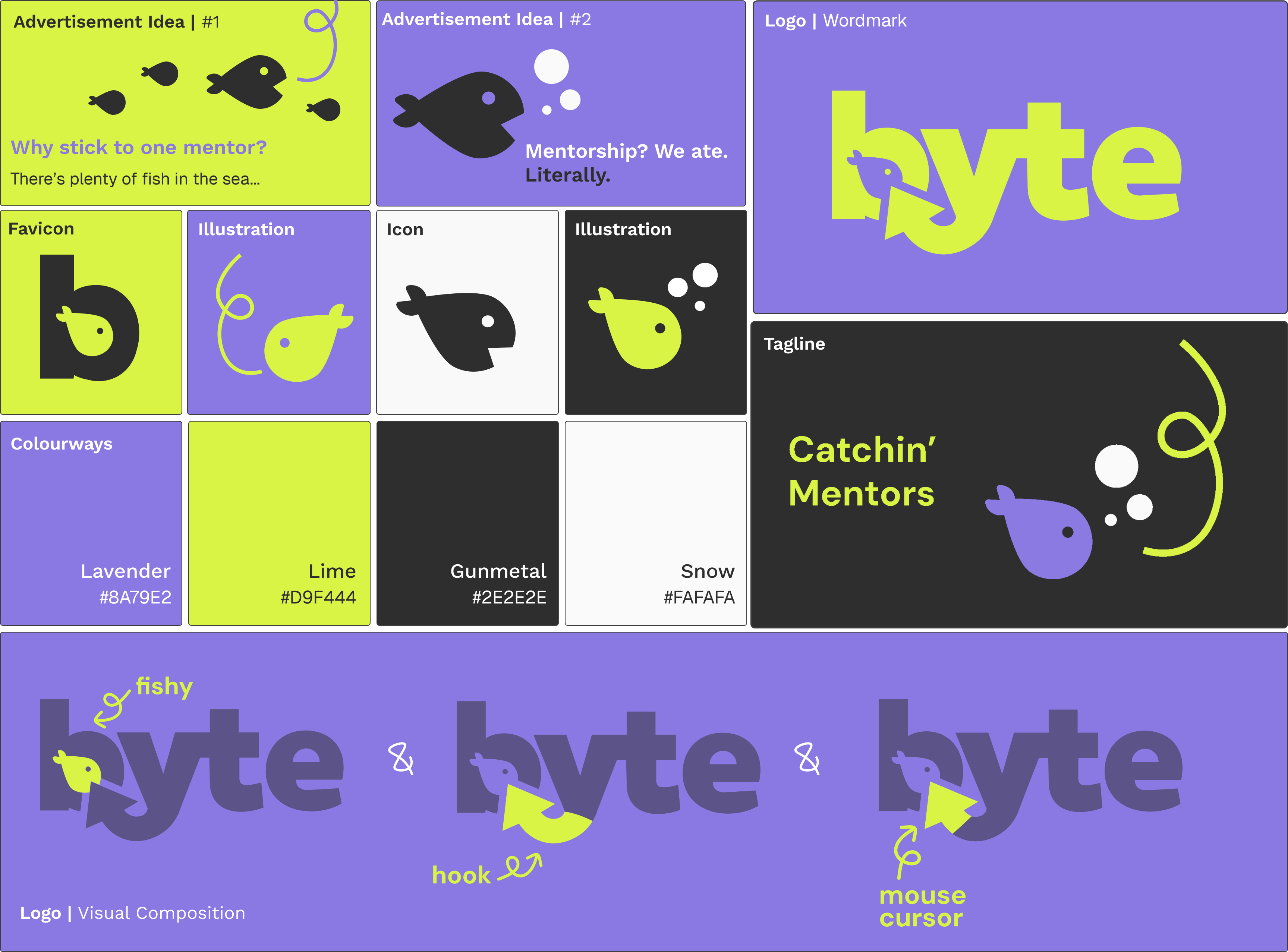
Visual Identity for Byte
The brand identity is fun, creative and young. I incorporated lavender to appeal to millennials, but also evoking a mood of creativity as violet is often seen as a colour that stimulates the imagination and artistic expression. Lime green is a complimentary colour to the purple, but also appeals to the Gen Z audience of using bold colours. Off-black and off-white to bring in balance to brand, while deliberately staying away from pure white (#FFFFFF) and pure black (#00000) as these would be too high in contrast causing eye-strain in users.
As you can see with the "Logo | Visual Components" I had a lot of joy creating a logo that represented all the elements of the brand: A fish in the B, biting a Hook (grabbing opportunities) that is a Mouse Cursor to represent the tech industry. As from my UI inspiration, I included playful flat illustrations that could be used within the interface but also in advertisement, building up that brand. I even turned the fish icon from vector to icon in Figma to use as the tab bar button for matching, creating a solid and outline versions to match the icon pack.
For the advertisements ideas, I choose Gen Z popular phrases to grab attention.I aimed to craft engaging taglines that would resonate with the audience, using humour to create a memorable impression. The bold, flat-style design effectively captures attention and aligns with the app's youthful and dynamic brand identity.
UI Workspace:

Wireframes on Left, Final Hi-Fi on Right
Figma is my preferred tool for creating interface visuals, as it is a design software I gained expertise during my studies to ensure readiness for industry. Figma offers features such as components, text and style libraries, and plug-ins for quick access to resources like Unsplash.com, as well as auto-layout capabilities.

Layout grid using standard 4 column mobile grid (16px Margin & 16px Gutter)
Another benefit of using using Figma is the grid system which allows you to stay within the constraints of the mobile UI. You can input whatever margin and gutter spacing you would like but I learnt during my time at IBM to adopt the 4px grid system (using multiples of 4) when designing. This system makes everything visually accessible and connect nicely with other elements. For example, I would use 4px or 8px for tight spacing between text and icons, but 16px between sub-headers and body.

Components are a necessary feature of Figma to utilise because they allow for smooth prototyping, and fast iterations. I already knew my way around components and states from my previous university assignments, but for this project I explored (right-hand side menu) booleans, instances swaps and variables. This allows me to customise the button with leading icons or trailing depending on the instance need, and swap the icon and text too. I used this consistently across my designs to make it fast to produce, reducing time creating different button instances or cards for the profiles of different users.
High-Fidelity:


Onboarding
Personalisation
Continuing on with the onboarding experience, personalisation upfront is key for the algorithm to match as soon as the user enters the app. There was temptation to leave this personalisation part with a "finish your profile" reminder, but I wanted the users to be able to jump straight into matching mentors without a delay in their experience. To minimise the amount of screens, users who clicked "I am currently studying this degree" will not see the work experience question; this is reserved for full-time working users and mentors.
The skill pill-buttons are a great visual feature to include in the profiles for quick scanning ability. I tried to find icons that closely resembled each topic. It is becoming apparent that people in tech are multifaceted and that led me to not pushing users to only one group; design, development, marketing. I wanted there to flexibility in what you want to learn, and that different mentors can give you different skillsets, utilising the opportunity to match with more than one mentor for different things. Additionally, this takes the pressure off of mentors (our persona, Sarah) to provide skills for everything because we're human, and we can't know everything.
Another pain-point for our mentor persona, Sarah, was the company she worked for being visible. This increased the risk of mentees expecting to be hired. I added "Company (Optional)" for users that were concerned about this, but I also addressed this specifically for mentors later on in the matching process.
Learning
In addition providing users with the ability to make meaningful matches, I wanted to incorporate a learning aspect to the app which keeps users actively using the app while they are waiting for matches, or for an upcoming session. By utilising the skill pill-shaped buttons from earlier, I introduced a filtering aspect which allows users to minimise the content they are looking to up-skill in. These topics will align with the selections made during the onboarding process, ensuring that users are not presented with content outside their chosen areas of interest. The feature also enables the application to recommend seminars and 'tips & tricks' that align with their interests on the homepage. Seminars are a combination of live and recorded webinars that are hosted by selected mentors, or company representatives. For example, Figma or UserTesting.com might want to give a webinar on the app as free advertisement to their product, using their own designers: this is what I have demonstrated in the last mockup with "Lucy Dexter" hosting a Figma, Back to Basics 101 session.
Matching Feature - Byte
Profile cards sit nestled inside the "Byte" screen interface, with prioritised information at the top-level for quick decision making. The user can 'throw back', or 'byte' at top-level or expanded, but when they click into the expanded profile they will see additional information to support their decision making process. I originally wanted a "Tinder Swipe" interface but due to complications with the prototype, I had to redesign and go for an interface similar to Hinge where the user can click the appropriate buttons instead of swiping left or right. In hindsight, this works better due to hand fatigue when constantly swiping.
In terms of prioritising what information is top-level vs expanded, I reflected on the research synthesised from surveys and interviews. A pain-point from a mentor expressed a need to clarify goals, relationship dynamic and expectations head-on. To do this I created a "basics" feature that allows the mentor to select their approach to mentoring through pill-buttons such as laid-back, hands-on, and nurturing. Additionally, I included timeframes (daytime, evening, or anytime) which gives the mentee transparency on whether mentor's availability would be helpful to them. I even included the number of mentees the mentor was looking for which gives clarity on how they would divide up their time. Sharing whether they are involved in the hiring process is crucial for mentors like Sarah, who worry that mentees might choose them with the hope of landing a job, even when that's not an option. Experience is an extra feature you can opt in/out for privacy concerns, and as mentioned before, displaying their place of work is also optional.
A feature you may notice is quite prominent is pronouns. I wanted this app to be inclusive and respectful of all people. Although this app's goal is primarily promoting the rise of women in tech, no gender is discriminated against. I did get feedback that it was confusing for me to use male users in my prototype when the app is specially for women, which is something I adjusted my designs to reflect.
Messaging Centre
A mutual match is nestled up the top under "New Bytes" until either party sends the first message. From the successful match screen, if the user clicks "Say Hello" they will be taken straight to the conversation to reduce friction and unnecessary button clicks. When you open this conversation, an automated tile will appear confirming your match and prompting you to either "Say Hello" which opens the keyboard, or "Book Session" which opens the booking system sitting under "sessions" in the pill-button menu above.
New messages are visualised with higher font weighs, a purple dot near the timestamp and a purple radius border. Incoming messages, such as Sarah typing, are indicated by the typing dots, known by Apple as the "typing awareness indicator". These dots indicate that the other person is currently typing a message, allowing you to wait before sending your own response. Users can sent attachments, or voice memos too.
It was important for the user to still access the profile once they had matched, to refer back to anything which is why the pill-button menu is a vital addition to this screen, alongside sessions for quick access to booking or checking the next, or past sessions. I have also added the booking confirmation card that is automatically sent to the conversation for both parties to be notified, but also a quick way of accessing the external meeting link, or adding to your external calendar.
Booking System
Sessions opens up the private schedule of the mentor which they have selected their availability in their own onboarding experience (something I hope to design later on). A calendar view for easy date-picking, and a time-picker underneath. This interface is more accessible than the sliding drop-downs that make the interface crowded and overstimulating. From there, clicking continue will take you to a confirmation page where highlighted in purple you will see the date and time selected, a back button incase of adjustments, and a few questions to answer.
Referring back to the pain-points of the Sarah, our mentor, she wanted upfront expectations for the meetings, which is why pre-specifying the topics you want to address in this session was important to implement, again utilising the skill tags which give consistent UI across allowing users to quickly understand what they need to do with this certain feature.
Following on from there, I did not want this app to be a replacement for popular, and privacy-safe meeting softwares like Teams or Zoom, therefore I included options for the user (mentors would specify which ones they have in their settings to toggle on/off this feature). Additionally, they give more context in the comments section if they wish but this is not mandatory.I limited this comment section to a concise 30-word summary to ensure mentees provide focused and relevant information without overwhelming mentors.
The successful booking screen follows the same design of the previous success screens, with different illustrations. Highlighted text in the CTA colour-way to demonstrate important information such as mentor name, date and time. I have also provided a quick "add to calendar" function that would push appointments to external calendars, such as Apple or Microsoft.
Lastly, mentors and mentees can refer back to the session, and by expanding the card they can see the criteria filled out by the mentee. Amend and cancel are accessible too, amend would bring the user back to the calendar view, whereas cancel would pop-up a modal asking the user to confirm the cancellation request.
Figma Prototype
Branded Splash Animation
Guided Onboarding
Success Screens
Personalised experience with skills
Choose your learning goals


Set expectations from the start
Profiles with full transparency
Guided booking with shared goals
Reducing friction


Encouraging post-match momentum
Keeping the connection moving
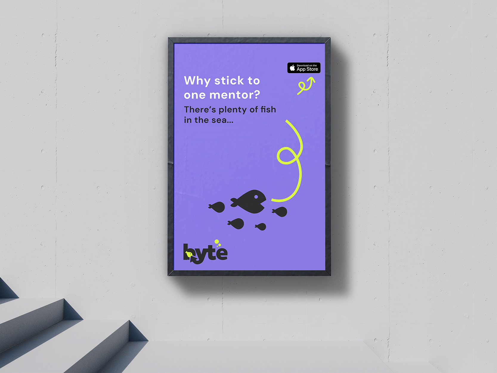
Flat Illustration Advertisement
With phrases like “plenty of fish in the sea” it's reinforcing Byte’s honest approach, that mentoring isn’t a one fits all, and mentees benefit from exploring a range of perspectives and professional relationships.
Research into eye-catching advertising suggests bold colours and humour are highly effective in out-of-home (OOH) marketing. Bright palettes and simple, emotionally resonant messages help cut through visual noise, especially in environments like train stations, bus and city routes, the exact locations Byte’s users would be. I additionally thought of how this type of marketing material could be put up within universities to boost student success and alumni networking.

User-Testing
In order to make sure this brand and application is on the right path, it was important to test it. I was able to get an hour-long session with my mentor, a product designer of five years in London, to use the prototype and give a detailed walkthrough on her feelings, thoughts and concerns when using the app.
After about 30-minutes her of going through the prototype without nudges, I asked her a few questions to provoke more feelings or thoughts she may not have said aloud during the initial walkthrough. This session was highly successful, and reaffirmed the design choices I had made by the user-research I had conducted at the early stages of this project. It was clear that I had designed with personas in mind, and backed up my design choices with research.
The branding nailed it, really connecting with the young tech crowd. The playful use of 'Byte' cleverly ties into the tech theme, and the app's look and feel was consistently engaging and fun.
User flows were intuitive and felt relevant to each stage. Although the onboarding included several screens, it was expected for this type of application and felt necessary. The progress stepper effectively guided users through the process..
The success screens were a thoughtful addition, encouraging users to explore different parts of the app and maintain engagement.
The way the profile information was laid out was really thoughtful, addressing the needs and pain points of both mentors and mentees. The 'byte' and 'throw back' features were clever additions that kept the brand's playful spirit. The info provided was relevant and useful for decision-making. Loved the ratings, and that you didn't add the typical "4 out of 5 stars".
Using skill tags was a fantastic idea and really takes the pressure off having one mentor cover everything, which can help ease imposter syndrome. It felt spot-on to use these tags throughout the UI, especially in the booking system, which helps mentors prepare for meetings with clear agendas.
It wasn't super clear at first that you could click on the main card to see more details about the profile. But once inside, the info was organised, and liked the added touches like experience and reviews. Maybe consider adding a quick walkthrough to highlight these UI features.
Having seminars and tips available keeps users engaged while they're waiting for matches or sessions. It's also great for those who might be a bit nervous about matching and just want to learn something first.
Reflect

Throughout this project, my goal was to create a platform that meaningfully supports women entering the tech industry by making mentorship more approachable, personalised, and available. Byte was designed to remove the uncertainty and hesitation that often surround mentorship platforms, offering both mentees and mentors a clearer, more relaxed experience when networking.
The primary motivation behind Byte was to help address Goal 10 of the UN Sustainable Development Goals, reducing inequality. By building a platform that supports the empowerment of minority groups, and makes professional steps more accessible, Byte contributes to a more inclusive and diverse tech community. The user-research deeply influenced every stage of the process. Empathy maps and “How Might We” statements helped me understand the frustrations of mentees like Alice: often unsure how to connect, what to say, or where to begin. At the same time, I considered mentors like Sarah, who needed to set expectations and maintain boundaries to avoid unfulfilling connections. These insights directly informed features such as shared skill tags, up-front profiles, and structured booking flows.
A key UX challenge came when I attempted to implement the swipe-to-match interaction but due to persistent technical bugs, I couldn’t achieve the smooth drag gesture I planned. However, this led me to rethink the interaction entirely. By drawing inspiration from other dating applications like Hinge and switching to a tap-based interaction model, I not only solved the technical issue but also improved accessibility by reducing hand fatigue, a win for usability.
While this phase of the project focused primarily on the mentee experience, future development will prioritise the mentor journey, enhanced profile controls, and deeper content personalisation.
This project highlighted the importance of flexible thinking and empathy in design, contributing to real-world equity. Byte aims to reduce barriers and close opportunity gaps, making mentorship accessible to all.
Explore Mentor Flow
Designing this side of the experience would allow me to explore how mentors manage session availability, set up their profile, and access the ability to host seminars. This is essential to ensure Byte supports both sides of the mentorship.
