
Brief
The purpose of this project was to identify a problem and create a research-led design solution. As a UX Designer interested in the effects design has on its users, I wanted to investigate the increase of Dark Patterns (tactics that nudge users to take unintended actions). Specifically, the impacts on users and businesses that adopt these patterns into their UI.
Through a combination of primary and secondary research, I explored the real-life impacts of Dark Patterns on user trust and brand reputation. The research uncovered a failure in user-experience, and a gap in design tools that could help businesses and designers detect and avoid these patterns within their own interfaces. As a response, I designed a software product called UXray.

Design Process
In order for this project to run smoothly and cover all bases, I adopted a six step process, which aligns with a design process used in industry:
Empathise
Research Insights
User-Personas
Empathy Maps
Define
Problem Statement
Mapping Insights
How Might We?
Ideate
User-Flow
Sketches
Mid-Fidelity
Design
Visual Identity
High Fidelity
Prototyping
Test
User-Testing
Adapted Designs
Reflect
Reflection of Project
Future Improvements
Project Timeline

Empathise
I began by conducting in-depth surveys with both users and designers to gather a comprehensive understanding of their experiences and challenges with Dark Patterns. This approach allowed me to create detailed personas that accurately represented the perspectives and needs. By mapping out empathy maps, I was able to visualise the journeys of both users and designers, highlighting their frustrations and aspirations. This foundational research was crucial in shaping the direction of the project, ensuring that the design solutions would be both user-centric and effective in addressing the identified issues.
User Survey Results
Of users had
encountered Dark Patterns
Said it broke their trust
with the company
Reported unintended spending
through hidden fees,
and auto renewals.
Warned family & friends about
a company using Dark Patterns
Designer Survey Results
of Designers could not
correctly identify Dark Patterns
Had been asked to implement
Dark Patterns in a project
Expressed discomfort in
implementing Dark Patterns
into their work
Were removed from a project
for speaking up about
Dark Patterns
Secondary research results
of consumers experienced unexpected renewals, missed free trial cancellation deadlines, or difficulty exiting services between April 2020 and 2021.
(Flint Bishop, 2023 🔗)
The largest lawsuit for breaching ethical and data regulations was in 2023 by Epic Games, fined an overall cost of nearly half a billion.
(Federal Trade Commission, 2023 🔗)
Dark Patterns found in 183 websites, this metric concludes that businesses rely on more than one pattern to increase profit.
(Marthur et al. 2019 🔗)
User-Personas
Based on insights from both primary and secondary research, I developed two key personas to guide my design decisions. The product needed to be genuinely useful for designers while also offering enough value for business CEO's to justify investing in it.


Empathy Mapping
To gain a better understanding of the needs and goals for each persona, I created an empathy map 🔗. Based on the insights gathered through my primary research and literature review, these design thinking methods help reflect the contrasting mindsets of a UX/UI Designer and a CEO.
The maps capture the thoughts, feelings, behaviours, and verbal concerns of each group. Jordan (UX Designer) reflects the internal conflict between user responsibility and the pressure of tight deadlines, while Eric (CEO) represents the business-oriented mindset focused on cost, risk, and return on investment.
By underlining their concerns and pain points, I was able to shape the features within the software that unify both perspectives, ensuring the tool supports designers while aligning with business objectives.


Define
After synthesising the insights from my empathy maps and user research, I created a problem statement that summarised the conflict between designers and business leaders. This stage focused on translating qualitative findings into actionable design solutions.
I used methods like “How Might We” framing and a feature-mapping Venn diagram to identify overlapping needs, prioritise potential features, and define a software direction that supports ethical patterns for designers while aligning with business needs.
Problem Statement:
"Designers lack the time and confidence to fix dark patterns, and business leaders don't see value in training or redesigns."
Mapping User Insights to Product Features:
When deciding which features would be most impactful for both personas, I took a different approach by creating a Venn diagram of five potential solutions for the software tool: in-software training, a regulation database, AI detection, AI-powered design solutions, and statistics on improved designs. I then mapped the empathy map insights onto this diagram to visualise which features addressed specific needs, or which offered less value.
This helped me clearly identify where pain points, motivations, and behaviours aligned with possible solutions. By highlighting these overlaps, I was able to prioritise features that tackled shared concerns, such as AI detection and regulation clarity, while also balancing the distinct needs of both the UX designer and the CEO.

Eric, CEO Mapping Insights

Jordan, UX Designer Mapping Insights
"How Might We?" Tool:
By creating the Venn diagram, I gained clarity on which features aligned most closely with real user needs. This allowed me to develop more focused and relevant ‘How Might We’ 🔗 questions. As a design thinking method, HMWs are used to reframe user challenges into actionable prompts for problem solving.
Once I had generated a broad set of questions, I grouped them according to the same five feature areas identified earlier. From there, I selected the top statements to focus my design direction moving forward.


How Might We? Mapping
Brand Principles:
To stay grounded when in the next stages (ideation and design), I created a short set of brand principles. These were informed by both user-personas and the design thinking tools above.
Improve, never complicate
Make ethics effortless. The tool should work in the background, not add to the workload.
Empower, don’t shame
The product should guide designers to design better, without judgement.
Speak business and design
Software Design must align with both team needs and stakeholder goals.
Ideate
After I had established a strong background for the design, I could begin building the structure of the software foundation. This involves creating a user-flow, which helps me understand the information arcitecture of the tool.
User Flow: Structuring the Software:

To begin ideating the structure of the platform, I mapped out a high-level user flow to define the core user-journeys to feature areas. This ensured that the five key features I had prioritised (AI Detection, Regulation Database, Training, AI Solutions, and Stats on Ethics) were intuitively grouped.
The flow also considers the onboarding experience, account creation, and access to a dashboard; where users can jump back in to engage with the tools without unnecessary friction. This visual helped me start thinking through interactions, potential pain points, and ultimately structuring the product primarily around the designer's experience.
As the ultimate aim is to support ethical decisions curated/authorised by the designer, that positively influence the end result for business stakeholders as well.
Low-Fidelity Sketches:
I began sketching early ideas for the UI by focusing on the core screens from my user flow. This allowed me to work towards a fully functioning prototype of the most critical journey: starting a project, scanning a design, identifying potential dark patterns, understanding their ethical implications, and resolving them.
As each issue is addressed, the project’s ethical score improves, reinforcing the core goal of promoting more ethical design decisions.


Mid-Fidelity Sketches:
Once I had my initial sketches mapped out, I transitioned into mid-fidelity wireframes to refine layout, structure, and user interactions. These designs focused less on visual and more on flow.
It helped me navigate to each screen, testing whether the software's main features (the scanning, feedback, and regulation abilities) were intuitive and correctly grouped together. Working in this fidelity allows me to mock-up ideas quickly while I brainstorm on the structure of the UI but not waste excess amount of time with nitty-gritty visual details.

Design
With a clearly defined problem and prioritised features, I transitioned into the design phase. This began with establishing a visual identity that reflected the software principles. I developed a minimalist interface using furturistic yet trustworthy colourway, and consistent iconography to ensure usability and accessibility. With the visual system in place, I progressed to high-fidelity wireframes and interactive prototyping. These designs brought the tool to life, allowing me to explore user flows, key interactions, and how each feature would function in practice.
UI Inspiration:

Brand & Visual Identity:

The visual identity for UXray is designed to reflect the software’s core values: clarity, trust, and ethical transparency. The minimal UI ensures that users can focus on their work without distraction, reiterating the principle that the software should operate seamlessly in the background, enhancing user experience without causing distraction.
A violet blue call-to-action forms the foundation of the interface, selected for reliability and professionalism. This helps users feel safe uploading their designs and confident in the software’s ability to deliver correct, and helpful insights. Any elements powered by AI are visually distinguished using a purple-pink gradient and the sparkle icon, a now-familiar visual cue that signals generative intelligence 🔗; this was an important aspect in the visual identity as it reminds users when AI is applied.
Across the interface, rounded elements for approachability and accessibility-aware design decisions support inclusivity and usability, further reinforcing the message that ethical design should work for everyone.
High-Fidelity:


Dashboard
Dark/Light Mode
To support all designers, UXray includes a dark mode option. This helps reduce eye strain and aligns with the minimal, non-disruptive experience. The toggle is easily accessible, ensuring that switching themes doesn’t interrupt Jordan's workflow.
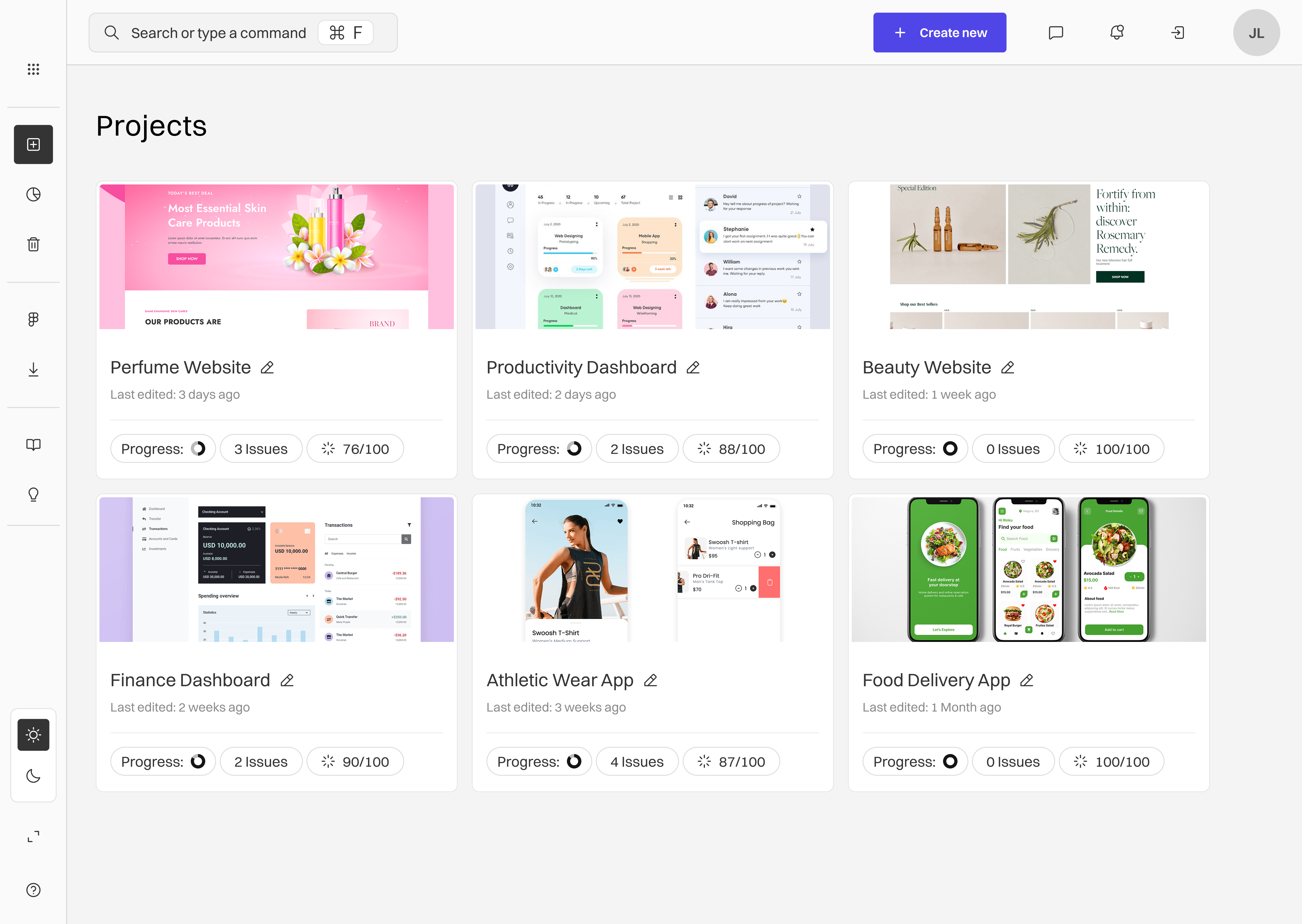
Projects
All of Jordan’s designs are inside Projects. The interface mirrors the “Recents” section on the Dashboard, intentionally, allowing Jordan access to project insights from either location. However, unlike the Dashboard, the Projects screen gives her full overview, including past work, and the ability to edit project titles.
Database
Regulations are broken down into digestible summaries and saved bookmarks. This aligns with both personas’ needs: helping Jordan stay up to date and bookmarking any regulations she may need to forward onto to her PM, and subsequently Eric, the CEO.
Learn
Regulations are broken down into digestible summaries and saved bookmarks. This aligns with both personas’ needs: helping Jordan stay up to date and bookmarking any regulations she may need to forward onto to her PM, and subsequently Eric, the CEO.
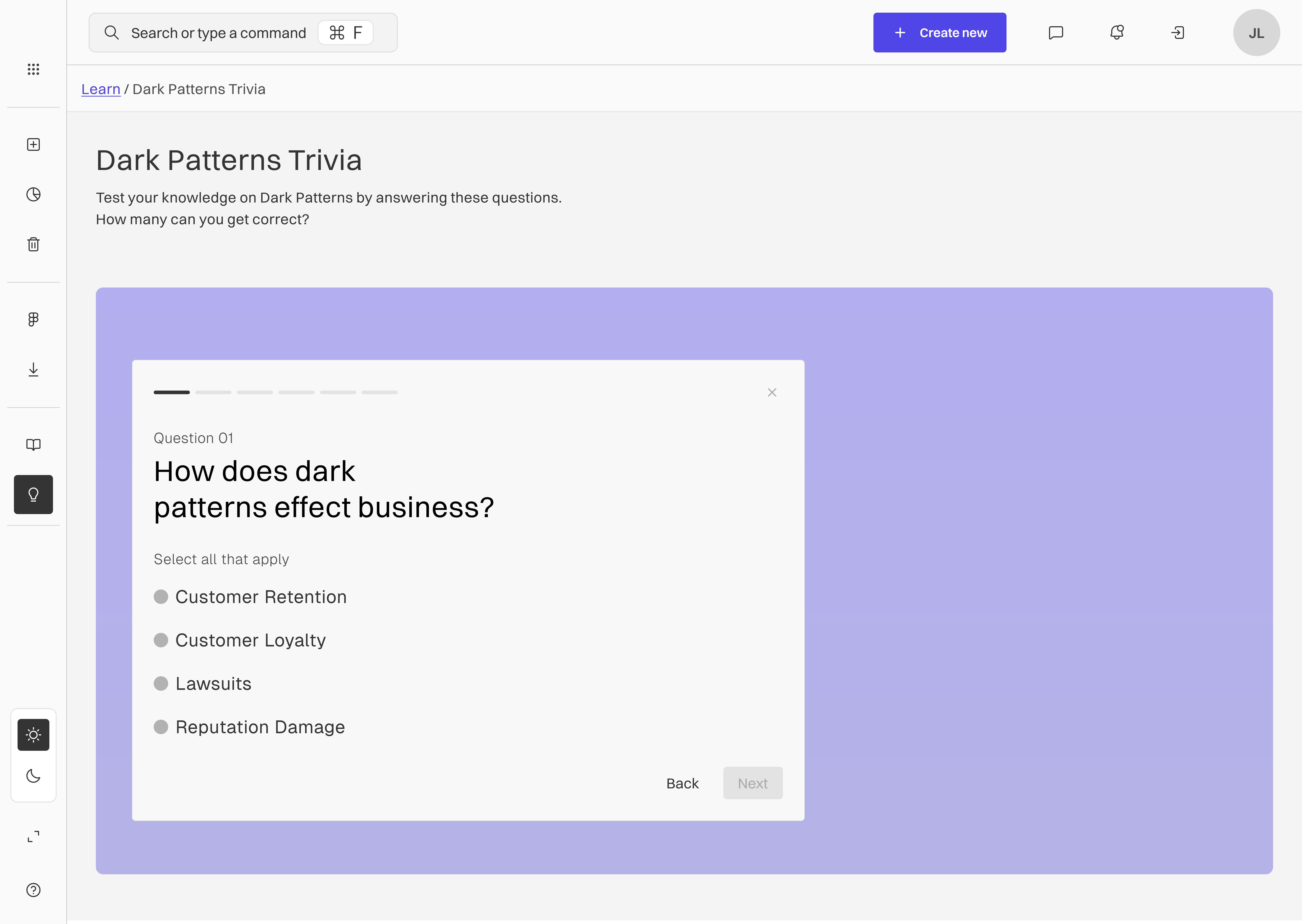
Dark Pattern Quiz
An example of the Learn feature inside the software. It supports our 'empower, don’t shame' principle by providing a fun, gamified approach to ethical design education.
Flow: Creating a New Project
Micro-interactions
Learning as you work
Smart AI Solutions
Scan based on your preferences
Manage the criteria


Quick access to Regulations
All your resources in one location
Integrating your favourites
Scan your designs anytime


Choices for Solutions
Always your choice
Reflect

Throughout this project, my goal was to create a tool that empowers designers to make ethical choices, steering clear of harmful UX patterns, and I believe I've achieved that. By diving into the world of dark patterns and ethical guidelines like GDPR, I designed UXray to be both informative and user-friendly. Initially, my sketches prioritised functionality, but referring back to empathy maps and "how might we" guided me to adopt a more supportive yet straightforward design, reflecting the brand principles values of trust and simplicity. A significant part of this process was finding the right balance between educational content and practical tools.
